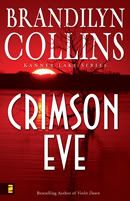
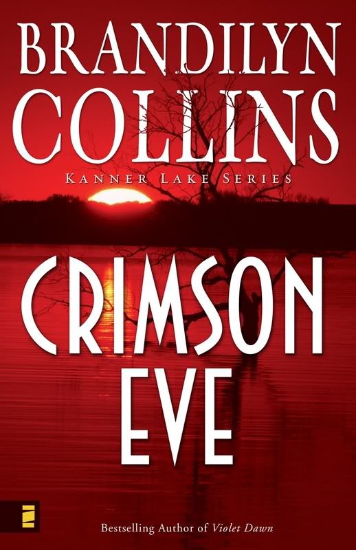
Last Friday I received the comp design for book #3 in the Kanner Lake series--Crimson Eve. I love it. And I certainly think it's bright enough to make a browser pick up the book.
(The web version isn't all that clear. To see a better version, click here.)
There's a lot of symbolism in this cover. The artist did a fabulous job of pulling issues out of the story and putting them in the design. The glow beneath the setting sun, the disturbed water. Most of all, the lone, bare tree in the midst of all the glowing red. And in the background--flourishing trees on the hill, with leaves.
My main character in this one is Carla Radling, the realtor. She's one of the Java Joint crew in Violet Dawn, and you'll see her again as a supporting character in Coral Moon. (Book #2, releasing in late March.) But little is said of Carla's past in those two books. Who is she, really? What's in her past that could force her into a situation like the lone tree, stripped of everything, on the cover? And what happens when that past catches up with the present?...
You'll also note the new cool Zondervan logo--the blocky-looking Z. As my other books go into reprintings, the new logo will replace the old on their covers.
I recently turned in Crimson Eve. This book releases in September 2007.
14 comments:
Beautiful cover, B. Congrats!
Great cover, Brandilyn! Awesome.
It is such a great cover. I know it's a cliche to say it this way, but it really "pops out" at the reader. :) And that tree is a little bit creepy!
Tina f.
I love that cover.
Love the cover! I can hardly wait to read Crimson Eve, but I have to read Coral Moon 1st.
Thank you for the list of authors. I'll be checking them out today.
Very nice cover. This whole series has been graced with a great thematic integrity between the covers and just wonderful design. :)
Looks good Brandiyln!
So do you suggest what the covers should look like? Does the artist read some excerpts or the whole book first? If it wasn't perfect would you have any say in having it changed?
I am curious about the author - cover art connection; in science fiction it is common to discover that the cover art is inaccurate or is completly unrelated to the story!
Grady, good questions. You've given me tomorrow's blog topic--so doubly thank you. Check back tomorrow. :]
Great cover. I rode past a lake today that made me think "Kanner Lake" because of the beauty of the water. Your description of the lake at night was very vivid and real. Now I compare all the lakes to Kanner which I have never seen with my own eyes and is imaginary. Now that's writing. I'm looking forward to Coral Moon.
Great cover!
And I would love to read the whole series. Hopefully when I visit Eden, my daughter, this spring I can read her copies of your books.
Congratulations.
Blessings
Great cover, Brandilyn. Love the branches weaving through your name. I miss that in the Coral Moon cover.
Looking forward to tomorrows post.
Love the color of the cover. Very eye catching.
Great cover. Carla says she likes it too.
Sorry to be so late! The cover looks great! Love the way the tree weaves into your name. Very cool.
Post a Comment